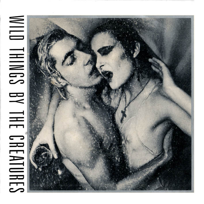
For their first Wild Things EP, O'Connor took up a suggestion from Siouxsie to develop a vaguely pornographic piece of illustrated mail from one of their more deviant fans. While The Creatures were on tour in Newcastle, a photo shoot was duly arranged in a cramped hotel bathroom. Adrian Boot took the photographs while O'Connor directed both the photos and the shower head. The resulting metallic black-and-white cover images, combined with the large, uncompromising sans type set on the vertical, still conveys a compelling seediness and sense of claustrophobia. Conceiving and executing such appropriate imagery was to become the guiding principle of Stylorouge.
For a designer, there's a major difference between working for a client that produces paper clips or dog food, and an artist who creates music. Or a film maker, novelist, or choreographer for that matter. In effect, your efforts become a representation of their creative endeavour and, on a more practical level, you need to learn how to deal with 'products' that live and breathe, have their own opinions and often answer back.
Around three-quarters of Stylorouge's design output is commissioned by the music industry, so the dilemma of satisfying client, artist and end-user crops up on a daily basis. In addition, the work must fulfil the designer's personal standards. No tow jobs are alike. Debut singles need to be approached differently from fifth albums. An artist may be changing direction and want this reflected in his or her visual persona. The record label may want to appeal to a specific market sector. The band could be on the other side of the world on tour and unavailable for photography. And so it goes on.
Rob O'Connor